This is the second in a series of posts related to teaching math during the Covid-19 pandemic.
Around 15 years ago, when I was teaching Calculus II, I used an ice-breaker on the first day of class that simulated the spread of an epidemic. The activity certainly is not something that we could do now, but the results are instructive. I’ve added a another simulation that illustrates what we’ve all been hearing about the effects of social distancing.
A Mathematica Notebook can be downloaded if you would like to experiment with this model – I’m sure the programming could be streamlined.
I’d be interested to hear if anyone can come up with a way to to adapt this ice-breaker to online teaching.
The Classroom Simulation
Introduction: We’re going to model an epidemic. Here is how it will work. At the start of the process, one of you will be “sick” and we will go through a series of “days” Each day everyone will do the following: you will make contact with exactly one person by tapping him/her on the shoulder, telling whether you are sick or not, and then you can introduce one another. If you are sick and the person you tapped on the shoulder was well, then he/she becomes sick. If you are well and you tapped a sick person on the shoulder, you don’t become sick. You may be tapped on the shoulder more than one time or not at all in one day, but you should tap exactly one person on the shoulder. As the days pass, you may tap the same person on the shoulder more than once — ideally you should choose people randomly.
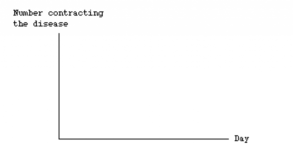
Before we get started, take out a sheet of paper. Draw what you think might be the graph of the number of people who get sick verses the days. This will actually be a discrete graph, like a bar graph, but you can draw a continuous curve to indicate the shape of the graph
You will get a “Post-it.” If it has the number 1 on it, you are the lucky person who is sick and starts the epidemic. When you get sick, make a note of the day on which you get sick on the Post-it
On the first day, the “patient zero” gets sick and we assume that day 0 has passed; so we start with day 1.
After 10 days, see if anyone is well. Continue until almost everyone is sick.
Stack your Post-it notes in the column marked by the day you got sick.
Computer Simulation
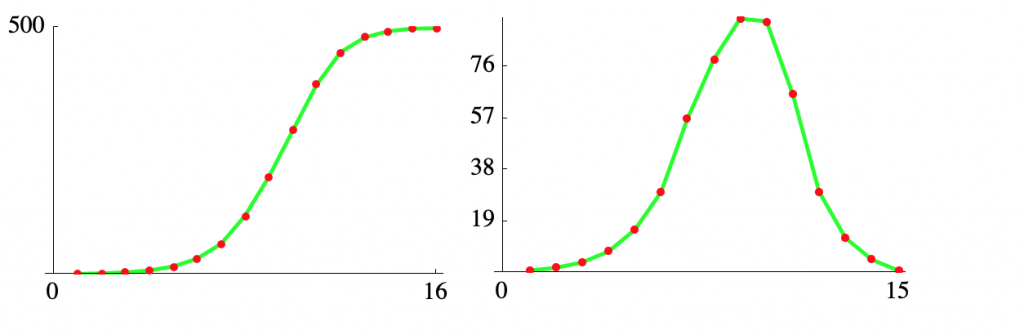
A computer simulation using Mathematica produces a similar result to the classroom activity – the code can be seen in the Mathematica Notebook. Here we assume 500 individual and find the the number of days before everyone is infected doesn’t change all that much with a larger “class.” Here are graphs of the cumulative infections and the daily new cases.
A second version of the model, which I added in 2020 allows for selecting a level of social distancing. Here we assume that a random 70% of individuals are quarantined on any day. Here are the results.
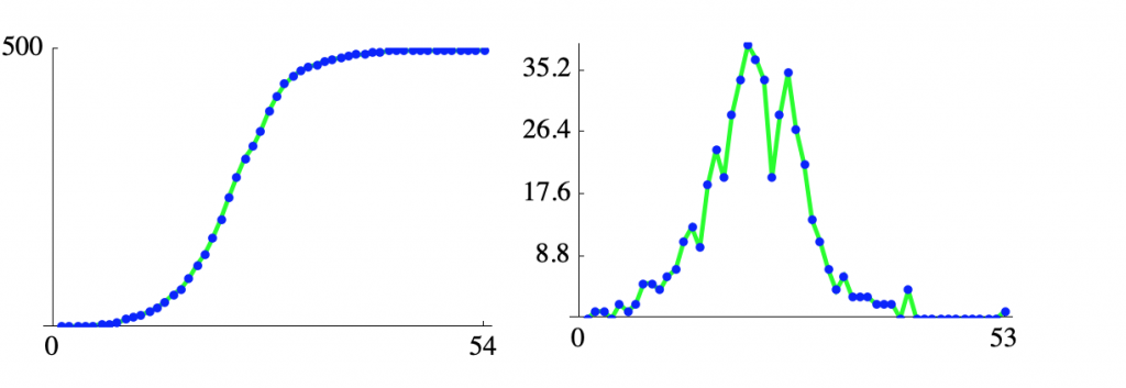
The two sets of plots have the same aspect ratio so you have to pay attention to the scales. Alternatively, here are the daily exposures for the two models plotted together.
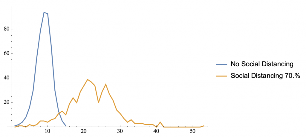
Here, you can see the flattening of the curve we’ve all heard about.