Many people ask me, “What is graphic design? Do you make graphs and posters?” To that I say, yes and no.
Art and design are almost synonymous in that their main purpose is communication. Fine art typically aims to communicate an expression, an event, or an idea. Graphic design as an enterprise communicates information and uses the same principles of fine art (heirarchy, composition, and how the human mind interacts with / translates imagery).
Graphic design–and fine art–is so much more than just pictures. It is a universal language that combines the human tendency to associate imagery with past experiences and the human mind’s innate organizational skills.
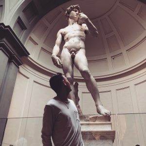
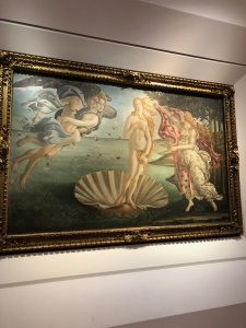
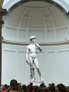
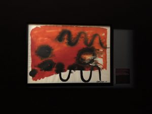
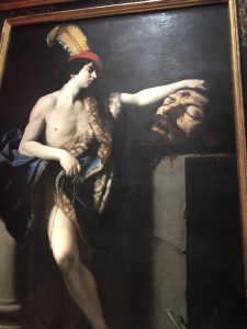
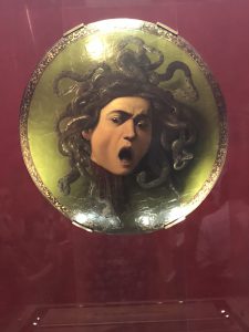
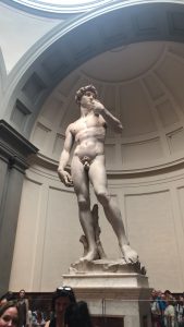
We visited the Uffizi Gallery and the Accademia Gallery today. The Uffizi is a collection of Ancient Roman, Ancient Greek, Byzantine, and Renaissance art belonging to the most powerful aristocratic family of Italy, the Medici, who reigned before and during the Renaissance and subsequently sponsored the Renaissance movement as we know and love it. The Accademia Gallery is home to 6 of Michelangelo’s unfinished sculptures and David, an impressive giant of a statue who is known to all who have studied art at some point in their lives. (Live out your worst nightmares in the next room over, as hundreds of plaster cast busts and statues stare lifelessly at you from all corners of the room.)
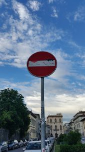
But my favorite piece of art today is this street sign. At first, I thought it was a turtle (my contact lenses need to be upgraded). But then I noticed a clever little thing: a nude model. This homage to fine art made me chuckle as I thought of Ophelia and Venus, among other naked women lounging on settés and beds.
It’s nothing fancy, but I’m sure that anybody from any culture would have understood what it was. Maybe they would have laughed too. Maybe some little kid would think it’s gross. Maybe an art critic would over-analyze it, bringing the sign’s “do not enter” meaning into the equation.
It is the simple idea and irony of the image that makes the art so clever. It is the way artists think about such normal things and find a way to change them.
I challenge everyone reading this post to find an everyday item and alter it without changing its overall purpose. An envelope, a paperclip, a light bulb or a screwdriver. How can you add another association while also maintaining the simple function and familiarity of the item?
It’s harder than it looks.



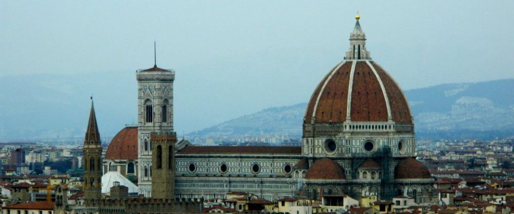





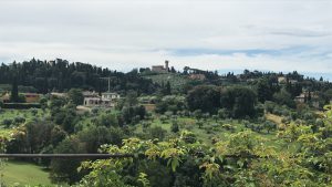




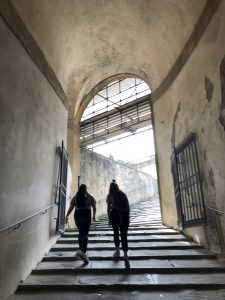
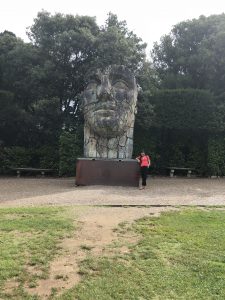
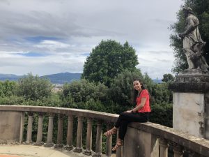
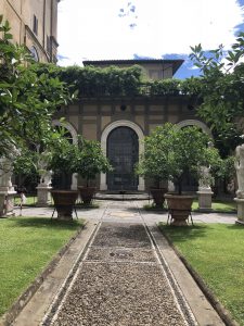


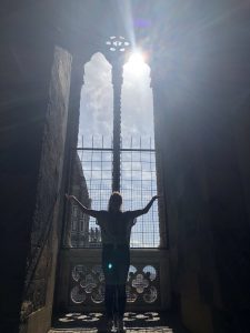


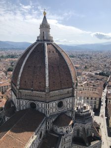
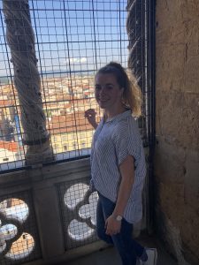

 Not many people can say they walked 1.8 km to ascend and descend over 400 stairs and take in a birds eye view of Florence, before 11am on a Tuesday. At least 8 Riverhawks can.