The British Museum is a fabulous place to explore – and it’s free! It’s home to things like the Easter Island Statue, the Rosetta Stone, and quite a few famous mummies. But the postcard exhibit was interesting as well. They had all different categories (altered, political, present day, etc.). My favorite happened to be the altered postcards. I tend to find collages very eye appealing because it plays tricks on your brain and allows for you to see an object in a different light. The way the artists play with scale and humor is just great. They were free to do as many experimentations due to the inexpensive way of producing them. This allows for all sorts of new ideas and interesting conversation starters.
Author Archives: madison_grover@student.uml.edu
To wayfind or not to wayfind, that is the question…
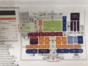
While the Victoria and Albert Museum was super interesting and I could spend all day on just one of the six floors it has, I found the way finding system to be completely average and not very well designed. Due to how large the actual museum is I understand that breaking up the map on different pages, but I still felt it was way too congested and confusing to navigate when trying to get to a particular exhibit. I propose they choose different icons to represent their gift shops/bathrooms/cafes so they don’t take up so much room and I also would play with the color palette to break more of the exhibits up as looking for numbers filled with white on an orange background is not the most efficient way to help someone navigate. I just feel like the map is too much to look at and wastes time. I want to be able to not feel stressed and overwhelmed when looking at a guide.
The London Transportation Museum
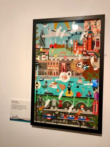
For our first full day out in London we ventured over to the Transportation Museum. Once there we discovered a fabulous poster exhibit called “London Stories”. My favourite poster of them all was this one by Katerina Bazantova. I find her illustrations to be playful and exciting. She has added so many details that you notice something different every time you look at it. I feel like she really incorporated all of the things that makes London, London; like the London Eye, Earl Grey tea, guards from Buckingham Palace, the Tube, the Thames, Vespa scooters, and Big Ben (are a few to point out). I also find her poster to be humorous as she has an English Cocker Spaniel playing a detective. All around she seems like a fun artist who really cares about London’s quirks and specialities.
