While the Victoria and Albert Museum was super interesting and I could spend all day on just one of the six floors it has, I found the way finding system to be completely average and not very well designed. Due to how large the actual museum is I understand that breaking up the map on different pages, but I still felt it was way too congested and confusing to navigate when trying to get to a particular exhibit. I propose they choose different icons to represent their gift shops/bathrooms/cafes so they don’t take up so much room and I also would play with the color palette to break more of the exhibits up as looking for numbers filled with white on an orange background is not the most efficient way to help someone navigate. I just feel like the map is too much to look at and wastes time. I want to be able to not feel stressed and overwhelmed when looking at a guide.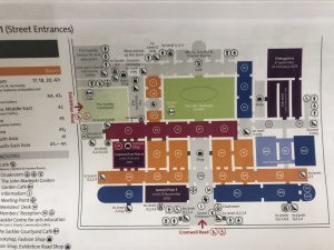
London by Design, Spring 2019
UMass Lowell Blog