The past two days have been so incredibly draining. I have never done a Hackathon before and yes I was very weary about it, but it taught me some amazing things. I was a little nervous about being thrown into this event with only a few days notice. I was also nervous about the team situation, and how many people would be on them, and what was expected of me. I feared letting my team down.
One time I was asked to really think about this question: What is your biggest fear? After a lot of thought, I’ve narrowed it down to this: I am afraid of not being good enough. And I mean that in all aspects of life. But this weekend in specific, I was afraid I would not be a good enough designer, teammate, communicator or even leader in some instances.
What helped my comfort level during the Hackathon was that my entire group in which I traveled with was there, two classmates were even in my group! It was nice to have familiar faces around and people I felt at ease to talk to.
Of course as one of the three graphic design students on my team which had the beautiful and creative name of BlueSky (haha) I enjoyed the visual parts of the project the most. Our solution for the issue at hand was essentially a chatbot (Ava) who could direct a conversation with someone who has a friend that could be showing signs of depression or who are depressed by consulting and advising each situation in a unique way.
Circling back to the part that I enjoyed the most, I was a soul believer that naming our service was a very important part of the process and would take a lot of thought. We wanted it to simple and straight to the point but also friendly and approachable. Searching for keywords that fit well with our product we came across the word Avail. Which means help. Stemming from that word we got Ava. Ava is also in the word available which she is, 24/7 through any social media platform. It’s as easy as friending her page.
I also had so much fun designing a logo for Ava aside my teammates. Looking at the process is one of my favorite things and it makes me feel very accomplished. Here is how we landed on the final version.
Starting with something like this, except an extremely rough version which was scribbled out on a sticky note:

Adding color and leaving shape but taking away the lines we got to this point (are you seeing fortune cookies too?):

Then one of my teammates suggested we look at the shape that is created once we combine both the A and V of the previous design:
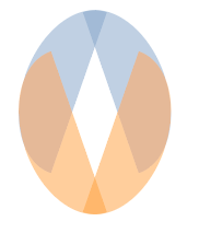
Refining the inner structure of the shapes we then got to this point:
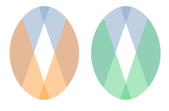
After realizing it resembled that of an easter egg we gave the shape a more round appearance, trying many variations of color to still give it a playful appearance we landed on this:
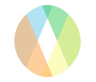
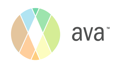
Finally, giving it a bit more dimension and sophistication with the spaces that we created between each opacity we agreed on our final logo:
I’m extremely proud of my team and all that we accomplished in the past few days and I think it was a great experience for us all.
