
Design creates culture. Culture shapes values. Values determine the future.
Robert L. Peters, graphic designer
As an art major, one of the things I was delighted to do was view all the different mediums of art in Paris. The traditional arts and architecture are to die for. However, as a Graphic Design Major, I was also very excited to see how graphic design was abroad. Back in the States, we are quite typography-heavy. Nevertheless, this is an observation based on what was seen produced in class and in our current media.
Typography is the text you see on artworks and how it is placed, designed, aligned, and styled. Due to how strong the fashion culture is in Paris, I was expecting the graphic design works to be more simple; however, the only solution to this speculation was to view it in person. Now here we are!
Public Transport Advertisements
Creating posters, banners, and other promotional pieces are jobs that Graphic Designers are often tasked to do. Graphic designers play a large role in branding and often work hand-in-hand with the marketing and business teams. With intentional branding and advertising, Graphic Designers can create a narrative for the company that evokes feelings within the consumer and guides them to where we want.
With that in mind, by placing advertisements in public spaces, we can cater to a larger audience, therefore maximizing our reach. Putting them in public transport spaces in which people use everyday, it is a foolproof method.
Places in which people are expected to be on stand-by are key. People will unconsciously build a routine in which they are used to seeing a certain advertisement in a certain spot. Some may even read it at first glance. What matters is that such design is in their minds and at one point or another, they will read and analyze what design has been displayed. Their next course of action is up to them; however, if the design is effective, the next course of action would benefit the company.
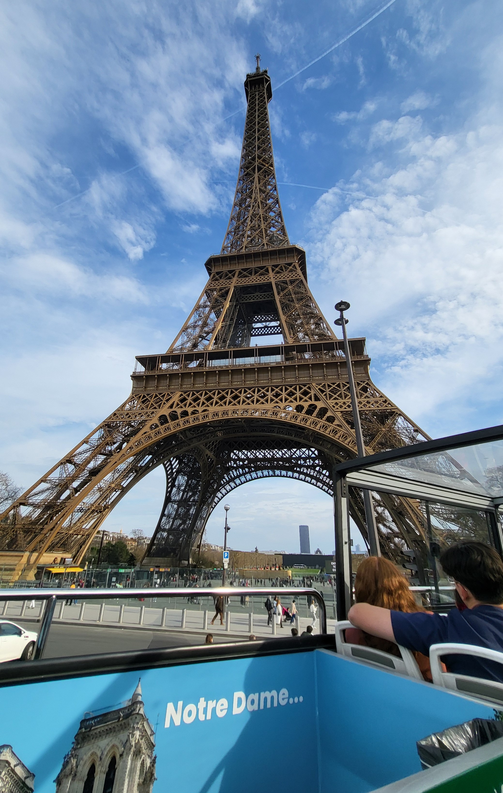
However, it is important to note that there are times when advertisements should not be used. After the TOOTbus tour we could view a variety of the Paris attractions all in one day. The actual advertisements on the bus included ones relating to the tour itself. Meanwhile, regarding the attractions itself, there was a void and or an absence of advertisements that did not directly portray the attractions themselves. Although it is not known whether or not the marketing is controlled in these areas, it is a good thing to note when thinking about intentional design and location.
There are many ways to create an effective design. Whether it be slapping on a famous person to turn heads, or by adding a variety of colors to catch the corner of someone eye, design can be altered in an infinite amount of ways.
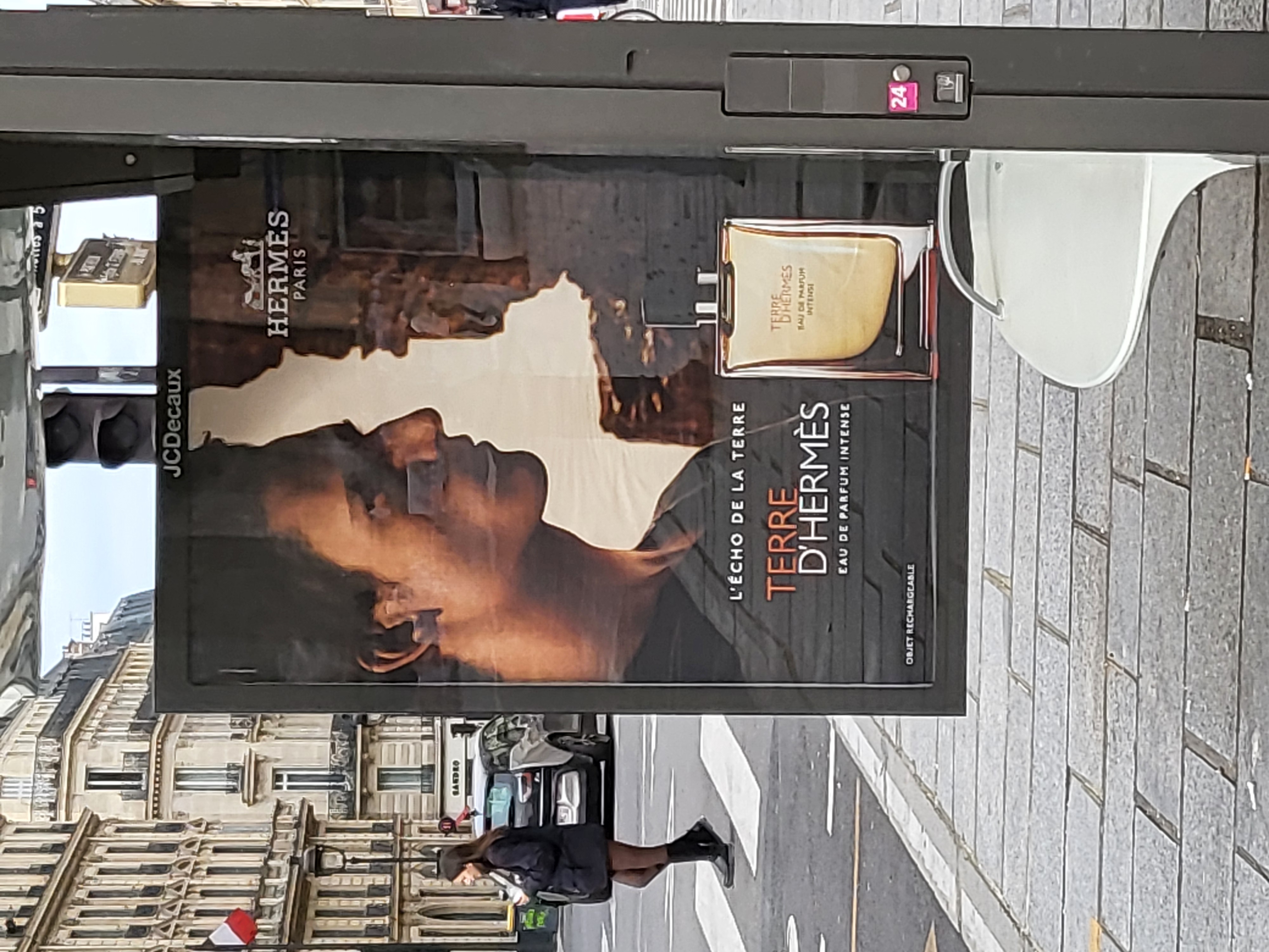
Something that I have noticed and hypothesized is that the Graphic Designing in Paris will be fairly simple. Paris has a large fashion presence and is known to have an extensive array of luxury brands and products. Furthermore, with such luxury brands, the product and the name read louder than the other aspects of the advertisements. Judging from what I have seen today, my earlier statement seems to be proven true.
Simplicity in Paris is Key
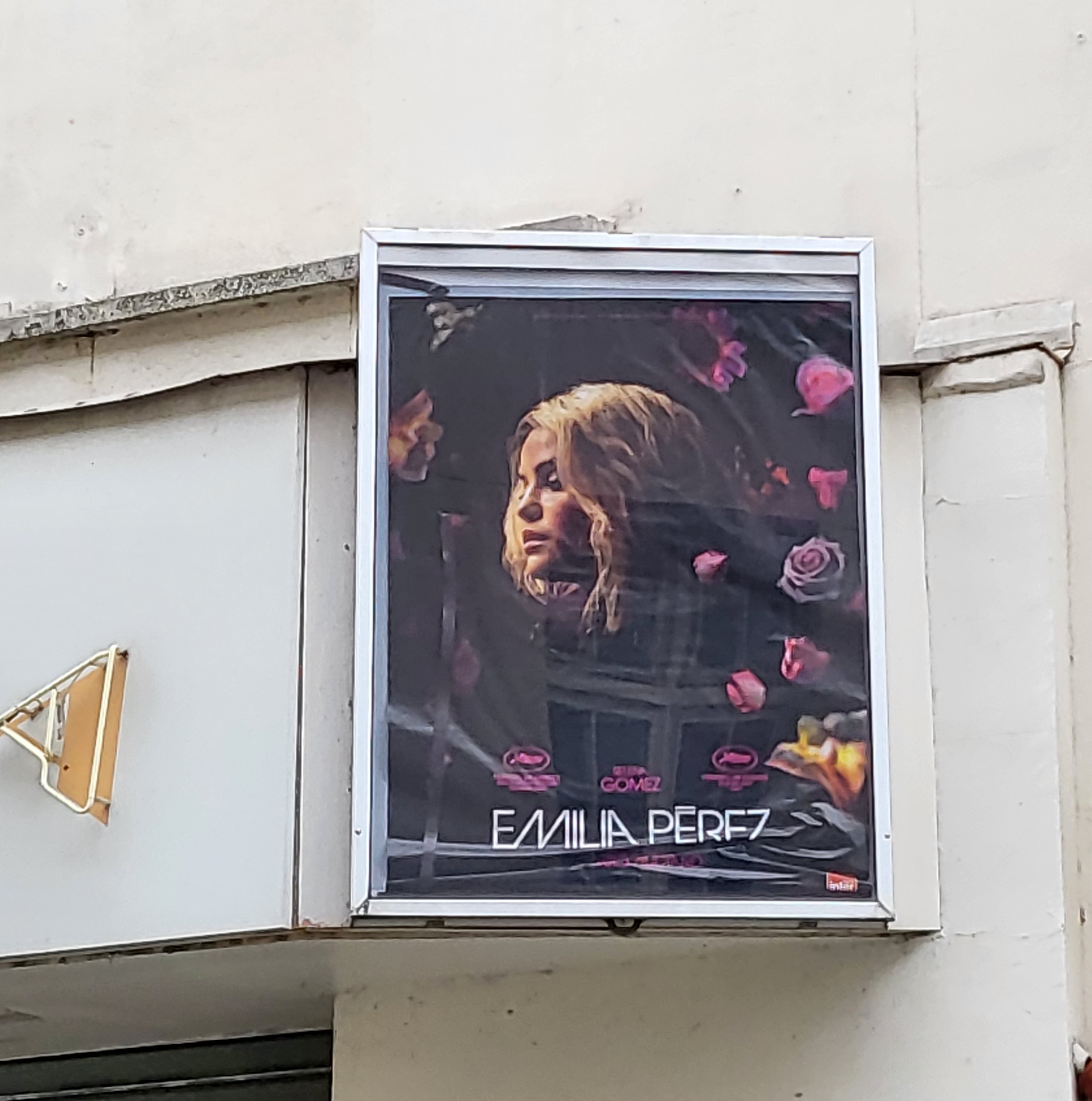
Down below is another fairly simple advertisement. The main model (Selena Gomez) and the main subject is the movie’s title (Emilia Perez). This specific poster adds a little flower accent into the design, but it overall does not interpret the whole piece at all. The text follows the overall color palette of the poster itself, and nothing is too bright or dull. The most important piece, the movie title, is big enough to where you can understand that it is the main point of the poster, but it does not distract you from everything else you can see.
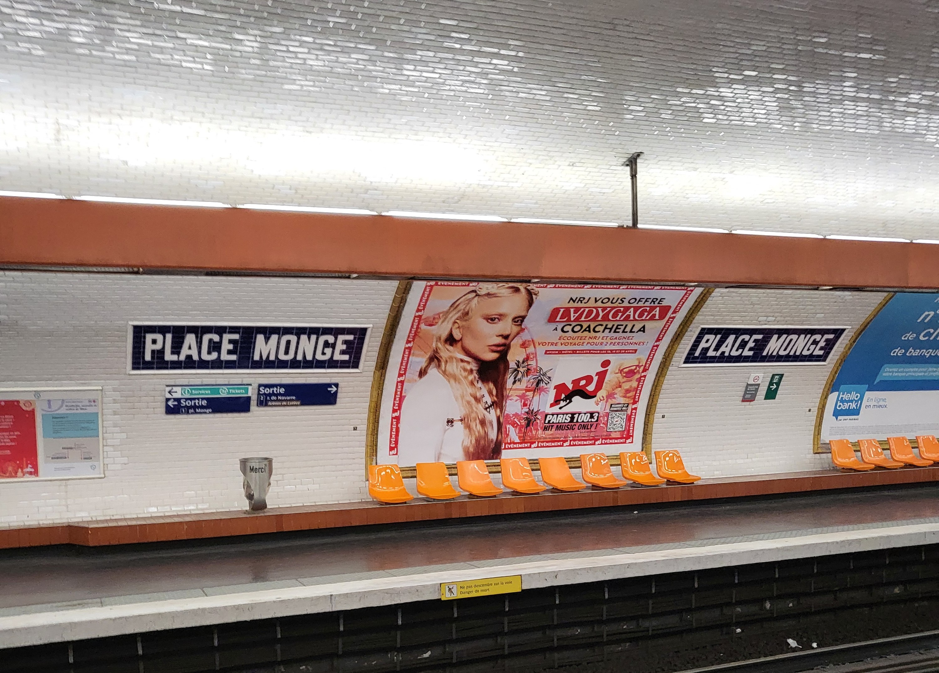
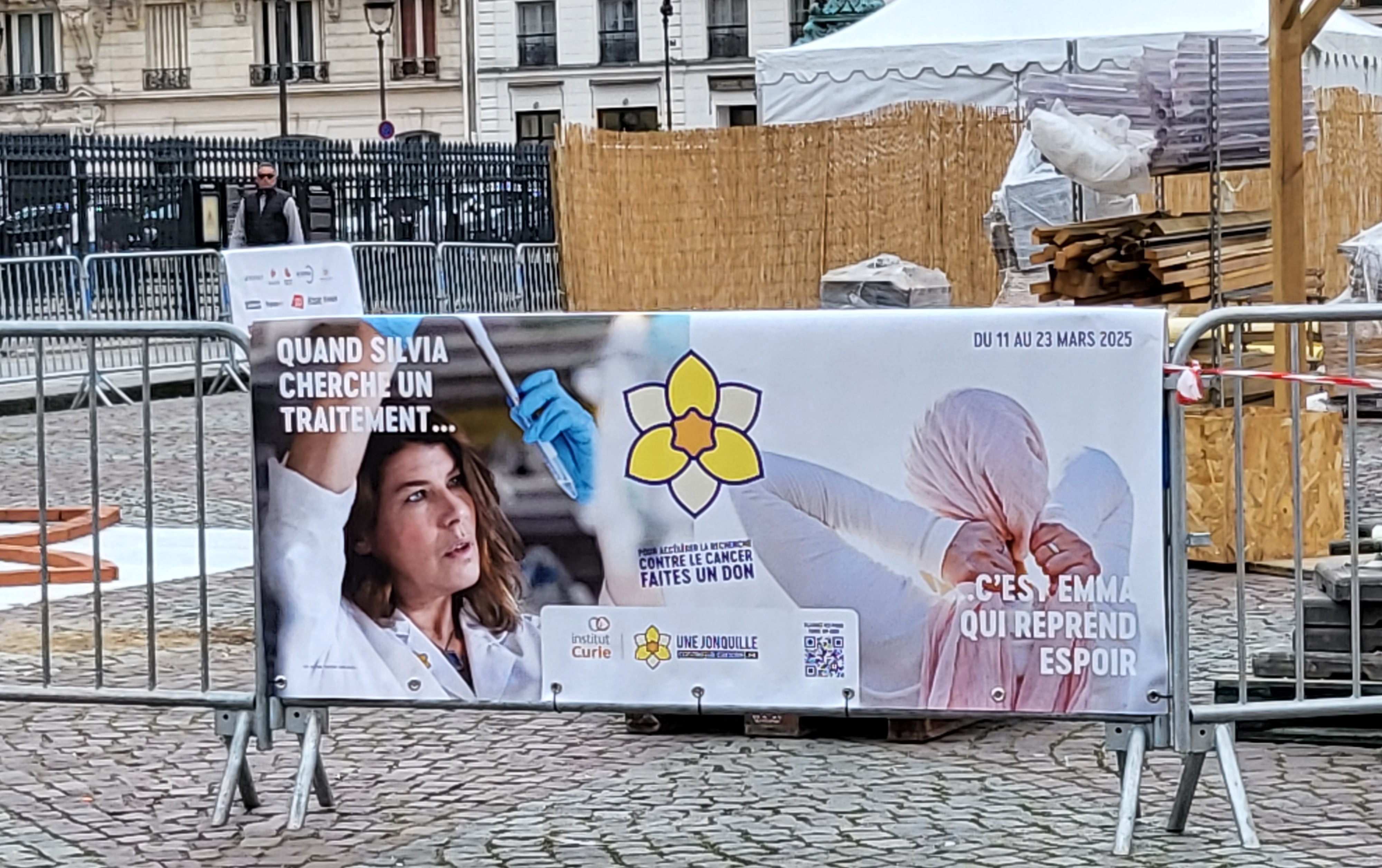
Down below is a design that is far from simple. In my opinion, there is just too much going on. Consumers are not able to focus on what is being advertised, and there is too much displayed all at once that is all similar in sizes. The split image within this banner does not have a seamless transition into one another and looks like two separate images rather than ones from a similar narrative. On top of that, the logo is just slapped in the middle along with all the other information, interrupting the flow of the design.
Beauty is in the Eye of the Beholder
Everyone will have a different view and opinion and what design is “good” and what design is “bad”. Although we get taught the specific principles and rules to follow in UMASS Lowell, such methods might differ from country to country. Therefore, there is a high chance that what is expected and prioritized in graphic design in America might not be a priority in France. Within this blog, I touch upon which designs I personally found both successful and unsuccessful. As a graphic design student who steers towards the marketing pathway, I still have a lot to learn about everything. I hope to travel to many more places to find the most universal way to be a great graphic designer.