Today’s visit to Kew Gardens couldn’t have come at a better time; this week, we’ve largely been in the heart of the city and major museums or tourist attractions, surrounded by people and noise. For most of the morning we just strolled and admired the plants. All of us had been eagerly anticipating Regina’s introduction to botanical illustration, because it’s a side of her career and her work that we don’t always get to see in-depth, since she’s teaching our design curriculum. (After today, I wish we had a botanical art elective by her at UML!) She treated us to an informal mini-lecture on the lawn after we all had the chance to look at work in the Shirley Sherwood gallery. Even though we had the option to not attend, we all had been talking eagerly about seeing our professor “in her element” for the days leading up to this visit, and we unanimously settled on the grass to listen in rapt attention. It was cool to learn about the process of creating accurate botanical art and see how both disciplines of design and botanical illustration inform one another. After that, we basically spent the whole day just wandering the gardens, soaking uo the sights.
Some of the best bits:
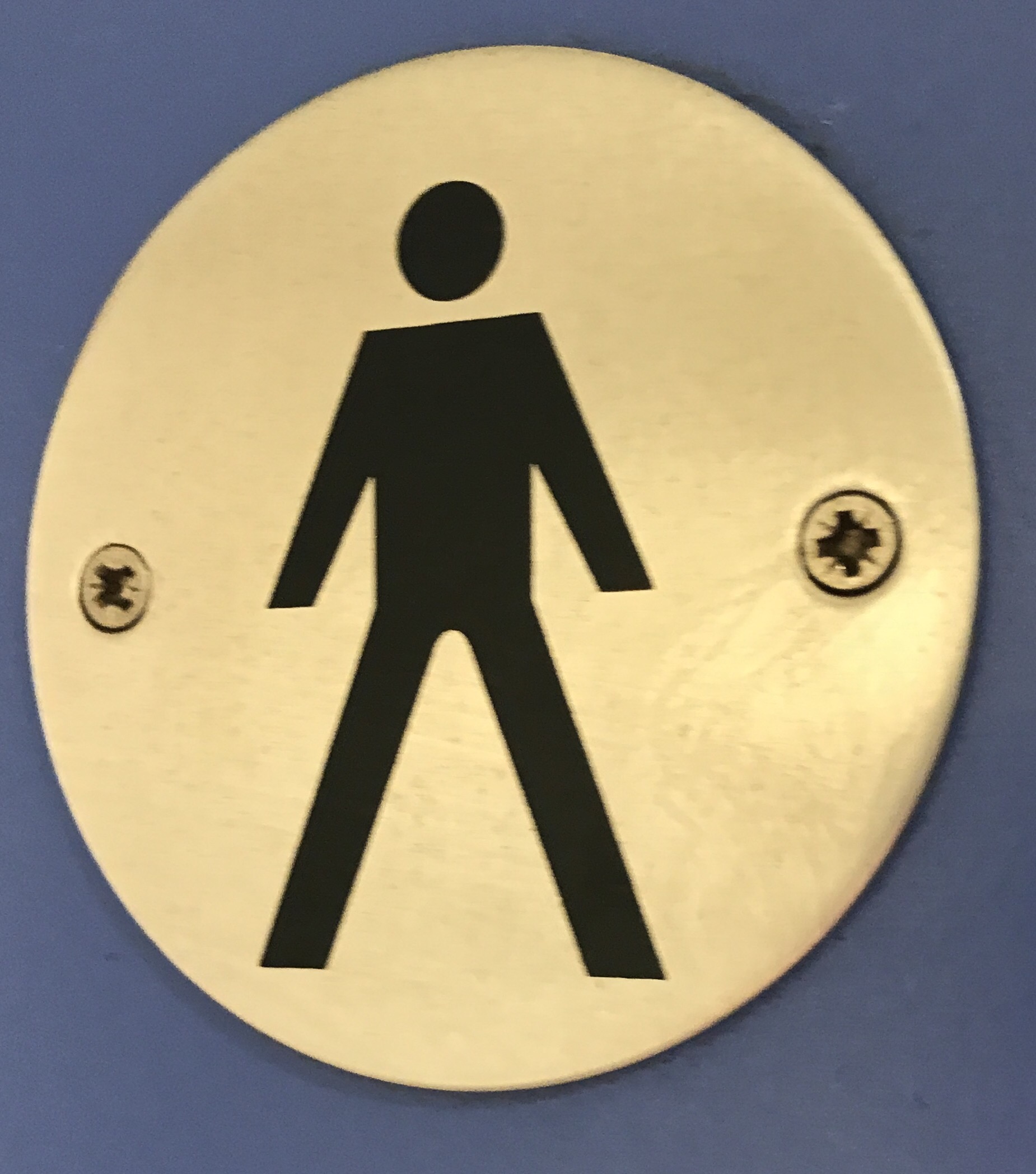
 This restroom sign made me laugh because its limbs are so strangely proportioned and angled. We’ve examined many wayfinding systems on this trip. Many people who aren’t designers, or in a design program, hear our major and think “graphic design” is purely creating images. The reality is that the meaning behind something is the true root of design. For example, the most important part of a wayfinding system is that you can actually find your way. Everything else should be in service to that goal. Of course, that doesn’t mean the appearance isn’t important or part of what we do; it’s just that we start with the purpose before choosing trappings suited to it. Then, I see signs like these: a perfect example of an image that’s clear, functional, and simple, but just looks silly as an image. It was a good reminder to treat each stage of a design project with just as much care and significance.
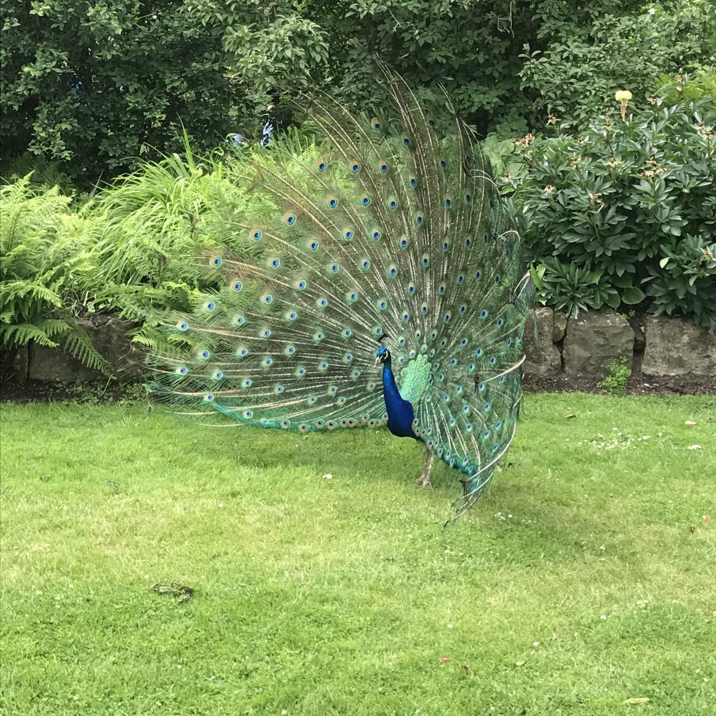
 This vain little peacock put on a show for us! We had started to walk away when he yelled, “come back!”, and started to lift his tail.
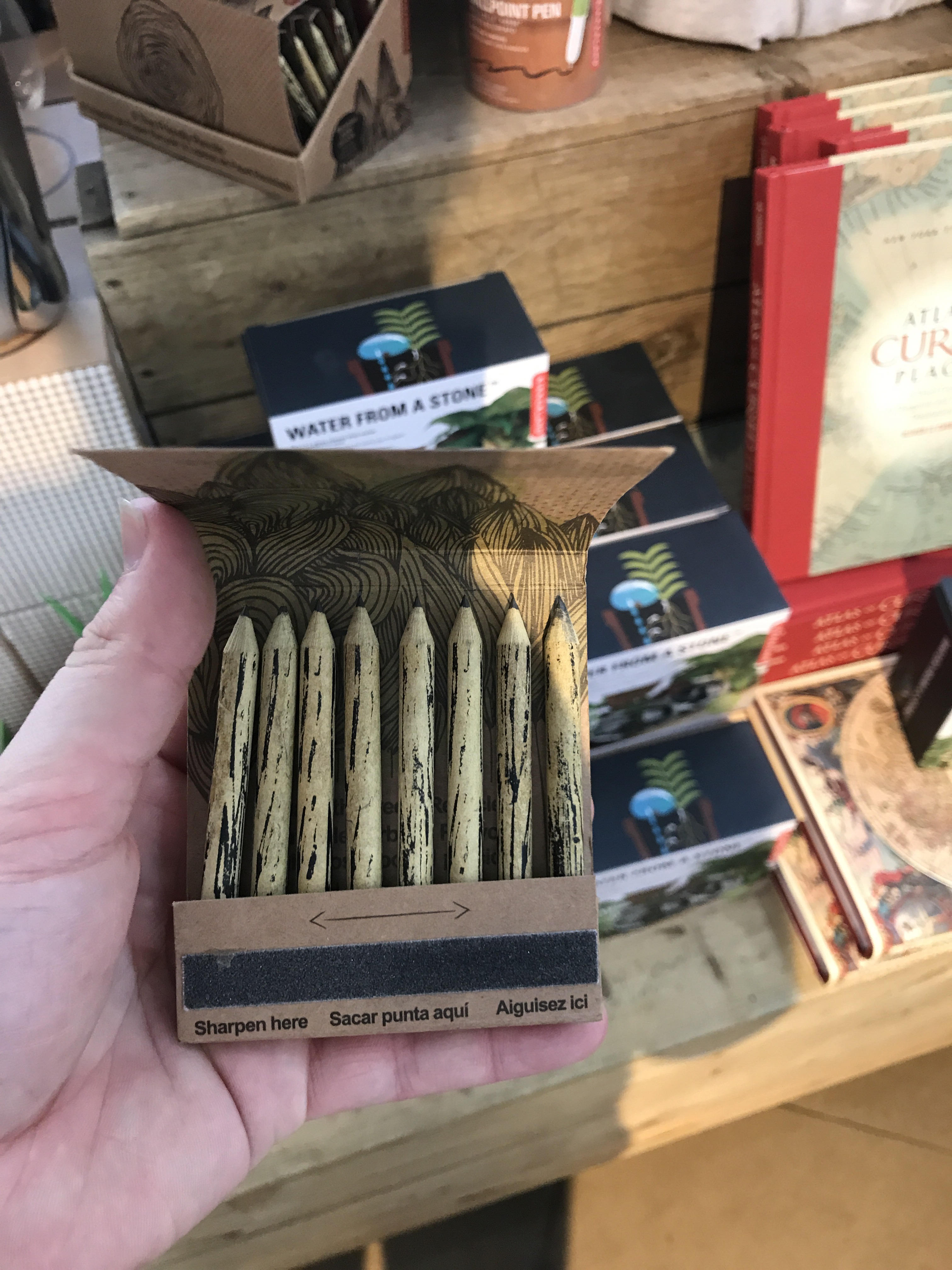
 This package design was super neat and innovative. I love that it doesn’t just look like a matchbox, but functionally has the sharpener/striking strip.
